Breakpoints
Breakpoints let you display different variants of your component when the browser window width changes.
Adding breakpoints
To start using breakpoints you need to add a variant property called breakpoint to your component in Figma.
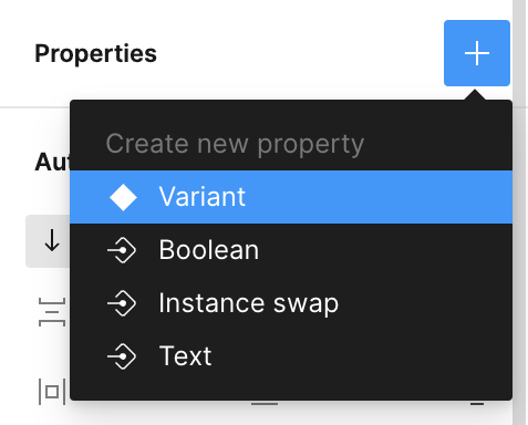
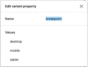
To do so, select the component in Figma, in the panel on the right click "+" button in the "Properties" section and select "Variant". This will create a new variant, you then need to change the property name to breakpoint (it's case-sensitive, so make sure to name it properly).
- Emotion
- TailwindCSS
Let's change the values of these variants to your liking, I usually go with mobile, tablet and desktop. After this, you can tweak how the breakpoint variants look.
Once you're done, open uipkg plugin and select the component, the plugin will detect the breakpoint property and generate a responsive component.
Breakpoints widths are taken from your component variants widths, if you ever need to change the breakpoint, just resize your component.
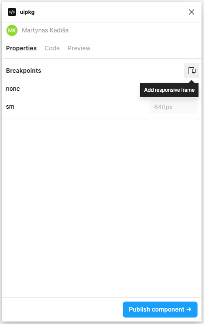
uipkg uses default TailwindCSS breakpoint names and an additional one (called none) for the initial breakpoint.
Possible breakpoint values are:
nonesmmdlgxl2xl
Let's change the values of these variants to one of the possible values above. After this, you can tweak how the breakpoint variants look.
Once you're done, open uipkg plugin and select the component, the plugin will detect the breakpoint property and generate a responsive component.
uipkg looks up breakpoint values from the default tailwind.config.js. If you have customized your Tailwind config file in your project, actual breakpoints widths will differ.

You can find breakpoints in action in this Figma file:
Responsive Figma frame
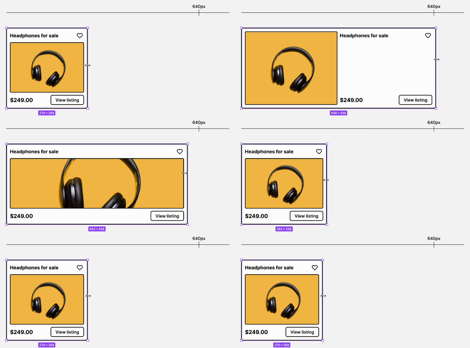
When you add a breakpoint property to your component, you can then create a responsive Figma frame to see how your component reacts to different widths straight in your Figma canvas.
After you create a responsive Figma frame, you'll have a new element like this one, it even works when the plugin is not open.
Previewing
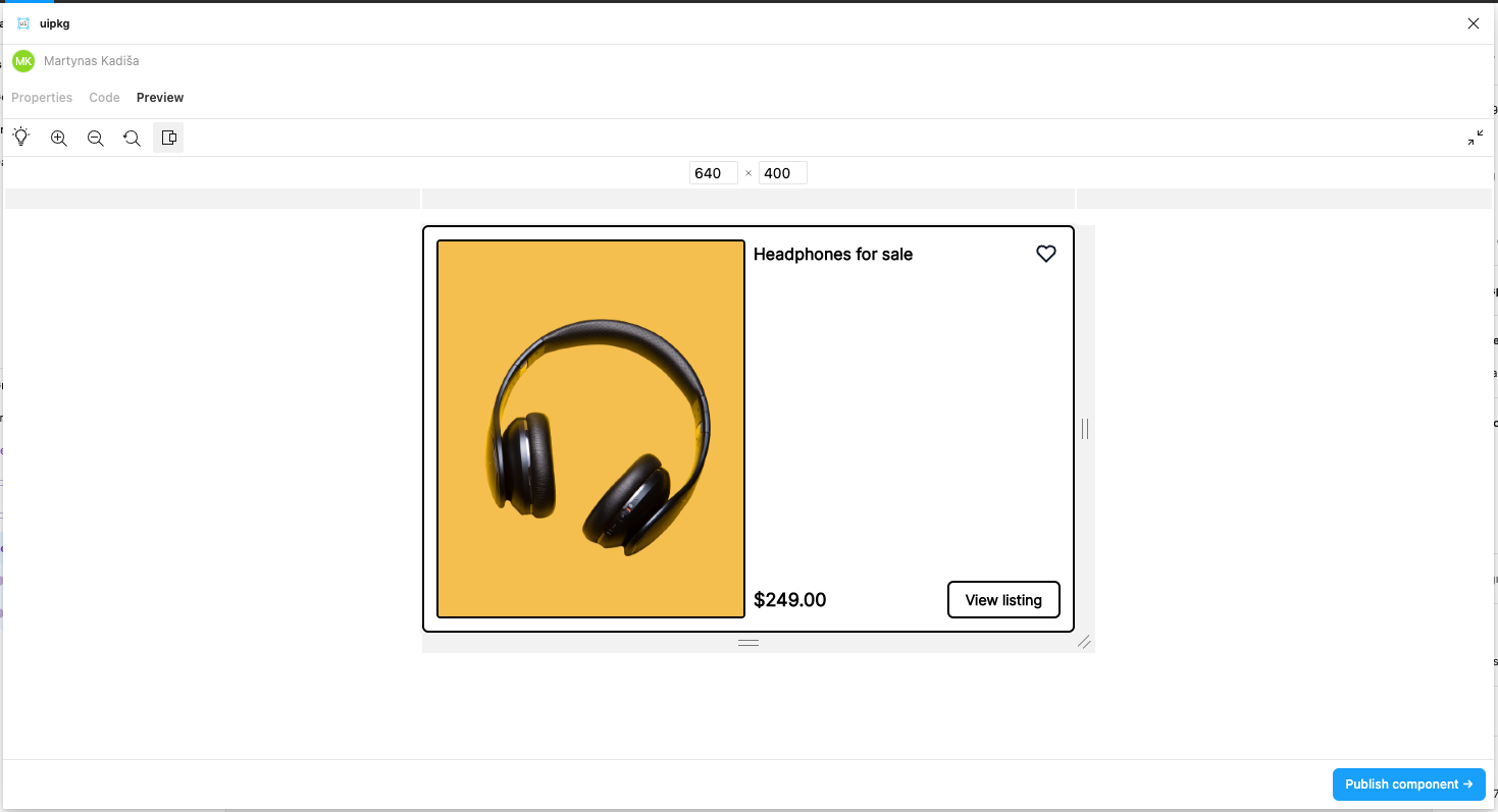
You can test the responsiveness of your component in the Preview tab in the plugin by clicking on the Responsive View button
