Adding props
Let's go back to Figma and learn how to make your component accept props. Open up uipkg plugin and select the Listing component.
Content props
Content props allow you to pass text, images, and children to a generated component. They can be added to Frame, Text, and Image elements.
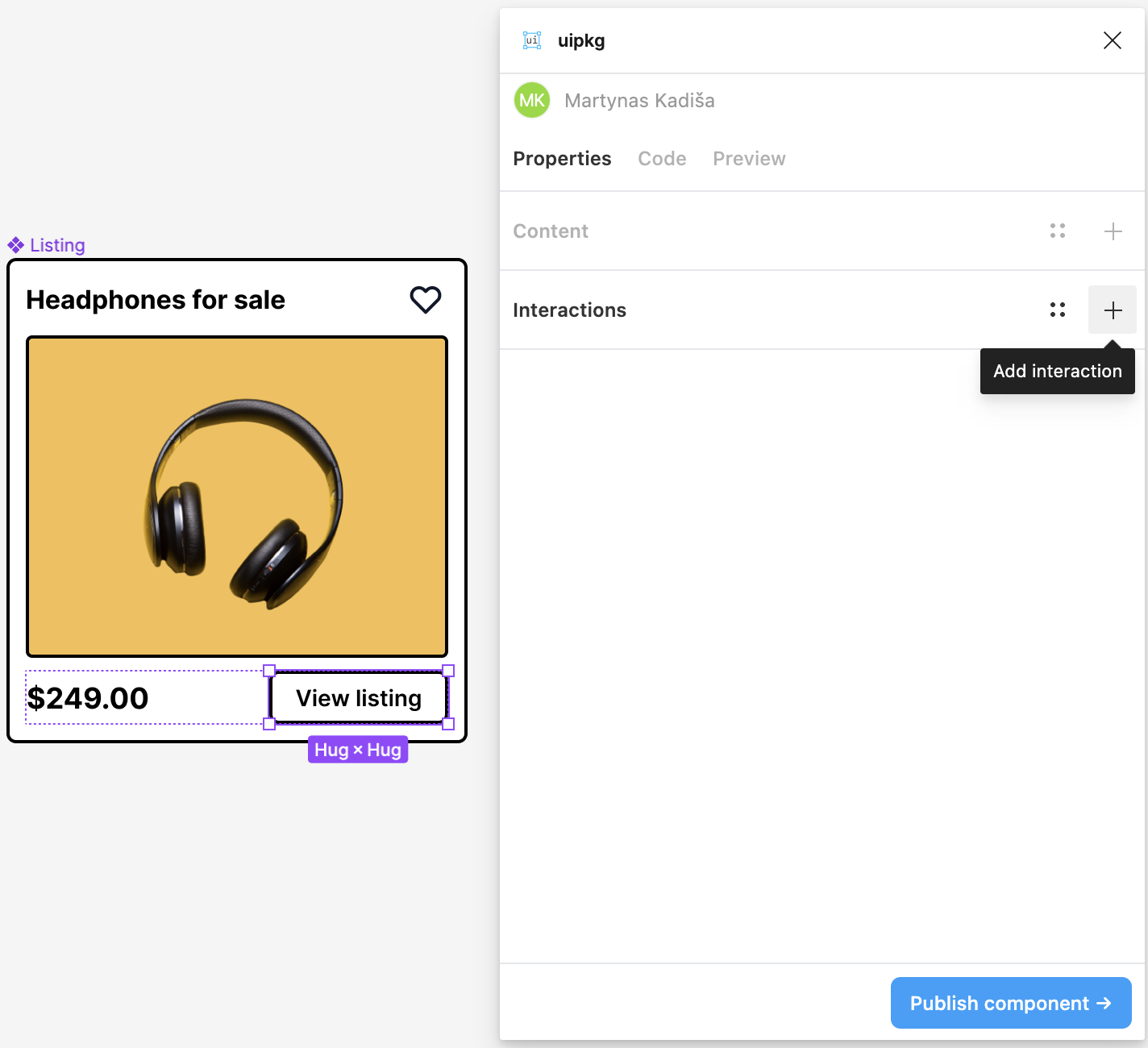
In Figma, select the title element and click on the add property "+" icon in the Content section of the plugin.
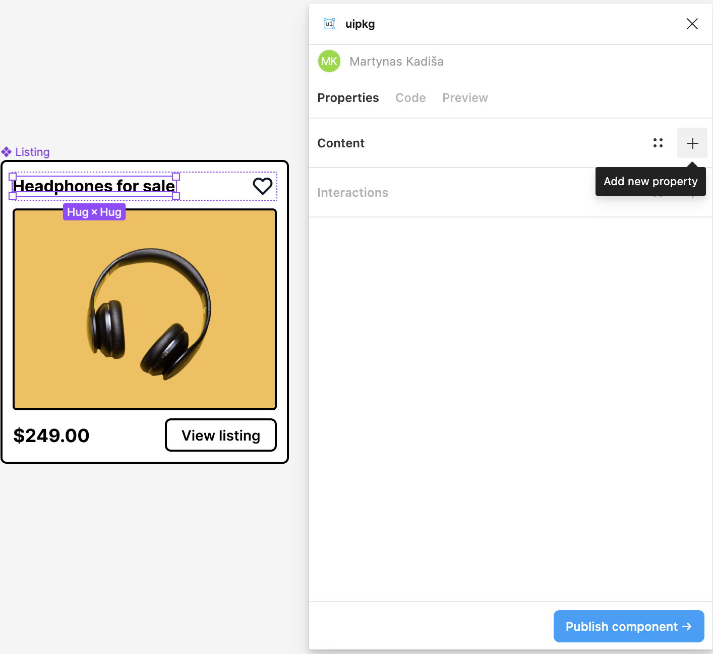
Let's do the same to price, button text, and image.
You can quickly select the deepest child by holding ⌘ CMD (or CTRL on Windows) and then clicking on the element
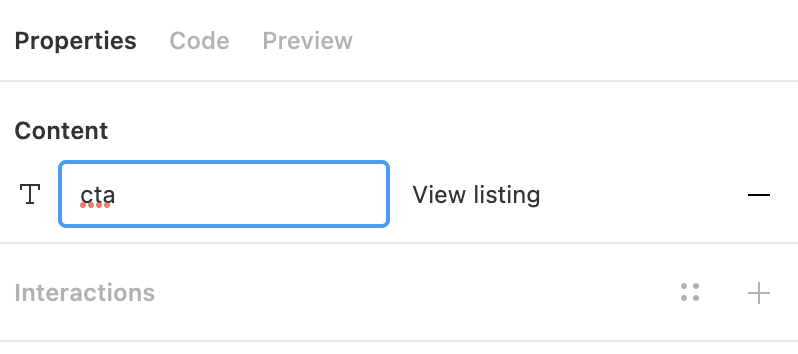
Let's also rename the button text prop to something more meaningful like cta
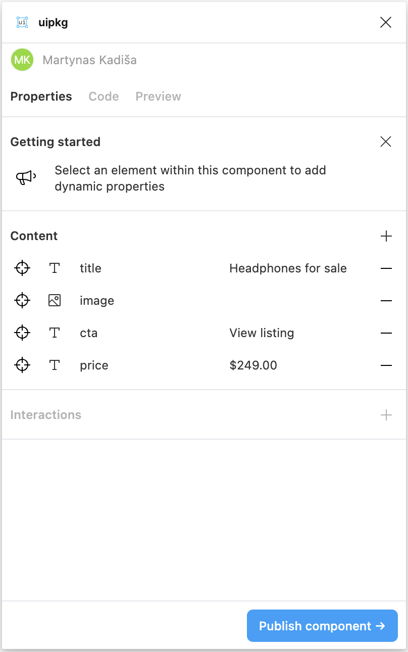
When you're done, you can click off on empty space and all of your props will be shown in the plugin, it should look something like this:
Interaction props
Interaction props allow you to add event handlers to elements. At the moment, only onClick handlers can be added.
Select the button element in Figma and add an interaction prop the same way we added content props:
Live preview
The preview tab can be used to inspect how your component reacts (pun intended) when props change.
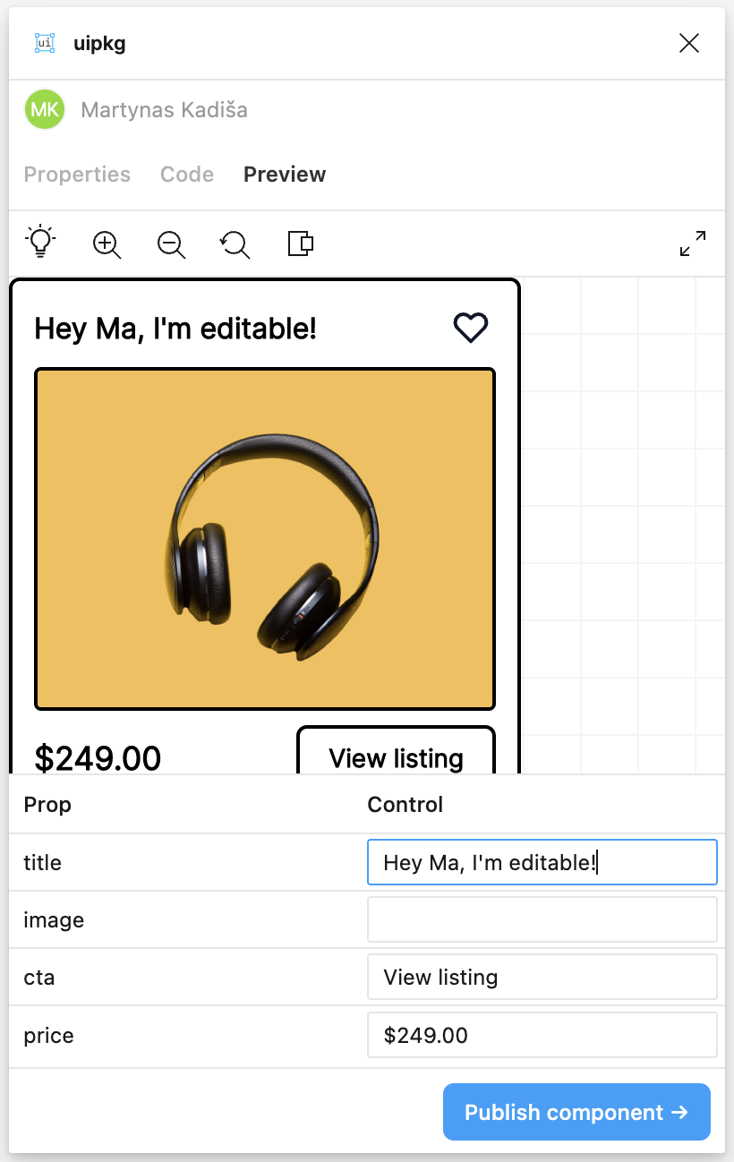
Since we added an interaction prop to the button, we can click on the call-to-action button in the preview and it will show an alert that the event fired.
Publish and install the new version
Now that we added some props to our component, let's publish it by clicking on the "Publish component" button. Confirm the scope and package name and it will publish a new version of our package to uipkg.com.
Once that's done, copy the one-liner from the success screen, open your favorite terminal, go to your project and paste that one-liner. This will install the latest version of the package to our project.
For me the command is this:
npm install @martynas/[email protected]
Using the new version
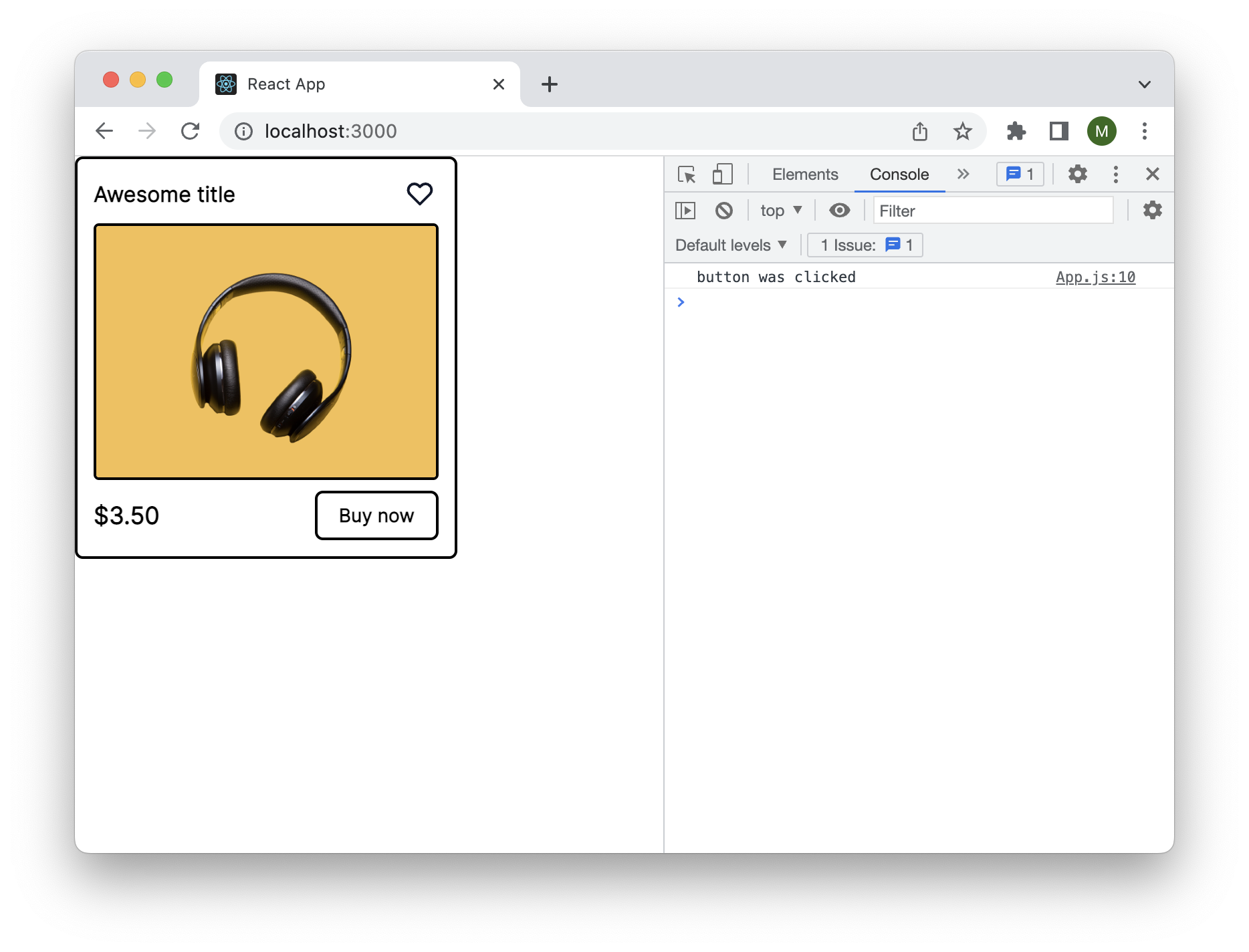
Now let's open up App.js and make use of our new props:
import Listing from "@martynas/listing";

const App = () => {
  return (
    <Listing
      title="Awesome title"
      cta="Buy now"
      price="$3.50"
      onButtonClick={() => console.log("button was clicked")}
    />
  );
};

export default App;
All uipkg packages come with TypeScript definitions, so you can always know which props are available to you
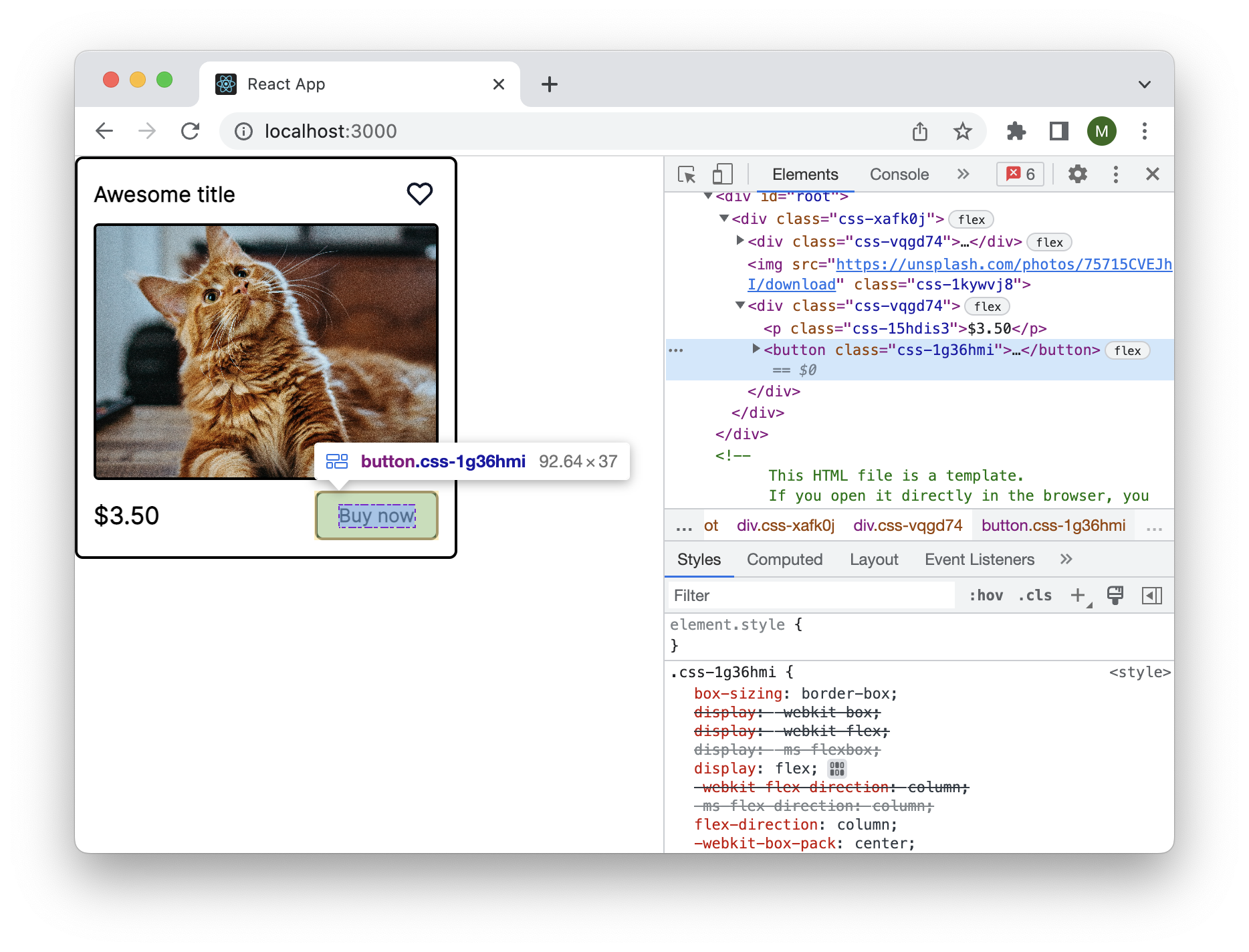
Start the development server with npm start so we can see what it looks like in the browser.
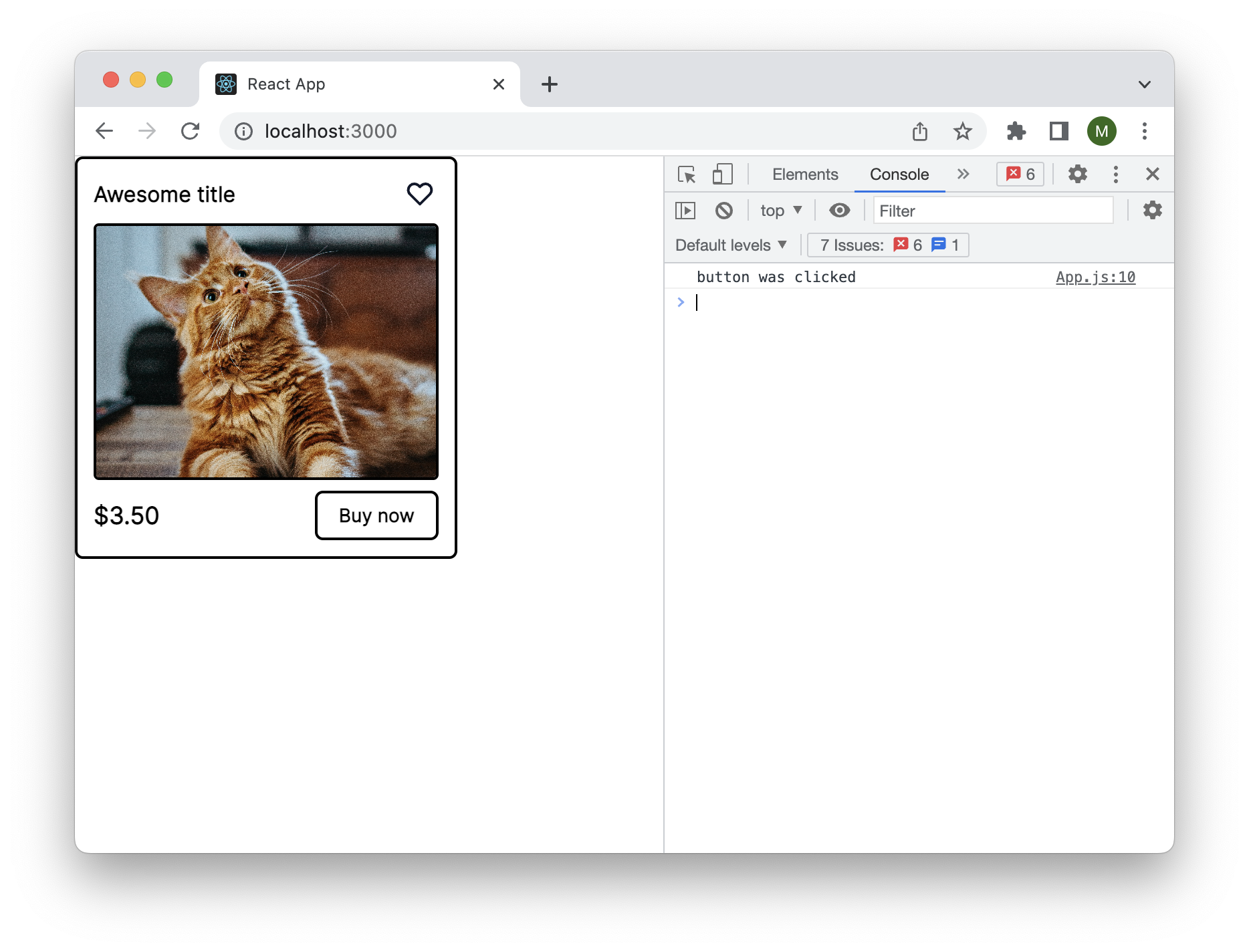
While we're at it, let's also replace the default picture with something else (e.g. a picture of a cat).
import Listing from "@martynas/listing";

const App = () => {
  return (
    <Listing
      title="Awesome title"
      cta="Buy now"
      price="$3.50"
      onButtonClick={() => console.log("button was clicked")}
      image="https://unsplash.com/photos/75715CVEJhI/download"
    />
  );
};

export default App;
There is still one problem with our component, the call to action button is a div instead of button. We can fix this by leveraging overrides prop like so:
import Listing from "@martynas/listing";

const App = () => {
  return (
    <Listing
      title="Awesome title"
      cta="Buy now"
      price="$3.50"
      onButtonClick={() => console.log("button was clicked")}
      image="https://unsplash.com/photos/75715CVEJhI/download"
      overrides={{
        Button: { as: "button" },
      }}
    />
  );
};

export default App;
If we open the element inspector we can verify that the button now indeed is a button! Clicking on it also fires an event that logs to the console as we defined it in our component example.
Overrides let you customize a component's behavior at runtime, you can any props, override styles and classes, and attach handlers.
You can learn more about overrides here