Content properties
Content properties, as the name implies, are used to pass content to your component. Currently, there are 3 types of them: Text, React Children and Image URLs.
All of these props have their unique symbol to help you distinguish between them.
Whenever you add a new property its name will default to the element's name.
Text
You can add text props to text elements.
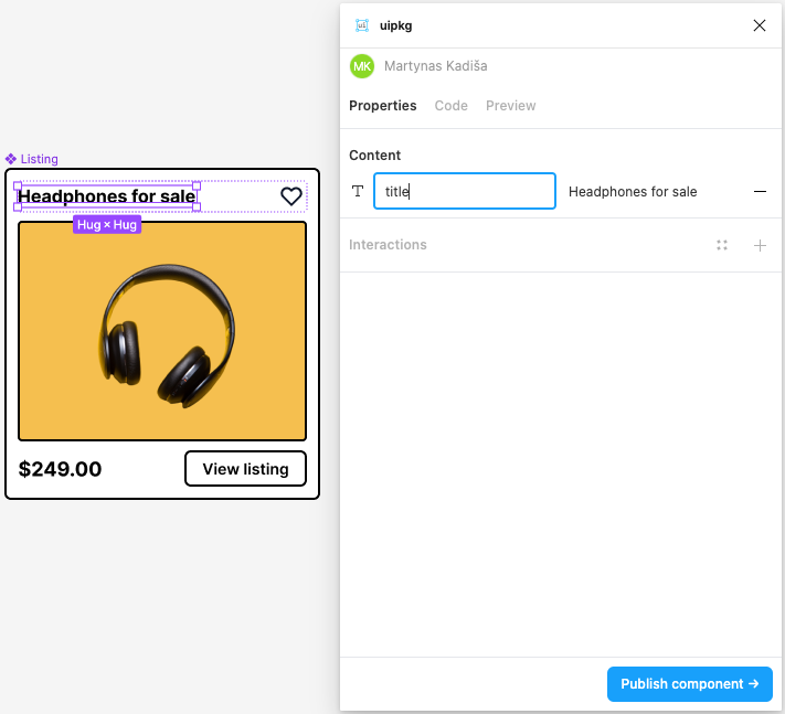
After the component is published, you can pass text prop like so:
import Listing from "@martynas/listing";

const App = () => {
  return <Listing title="Awesome headphones" />;
};

export default App;
Image
You can add image props to elements that have an image fill (frames and rectangles).
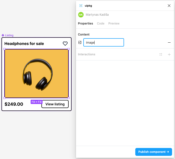
After the component is published, you can pass image prop like so:
import Listing from "@martynas/listing";

const App = () => {
  return <Listing image="/path/to/your/image.png" />;
};

export default App;
Children
You can add children prop to frame elements. This is a powerful prop that allows you to create layout components and compose them together.
Children prop has 3 different behaviors.
Append
Places children as the last item in the frame.
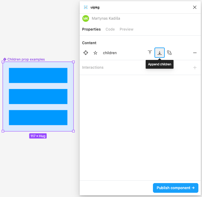
In the preview tab, you can see that the children prop content is placed at the bottom.
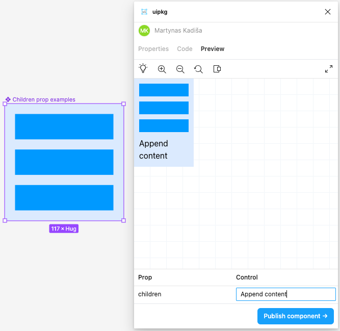
Here's a simplified output of the component above:
const Component = ({ children }) => {
  return (
    <div>
      <Frame1 />
      <Frame2 />
      <Frame3 />
      {children}
    </div>
  );
};
Prepend
Places children as the first item in the frame.
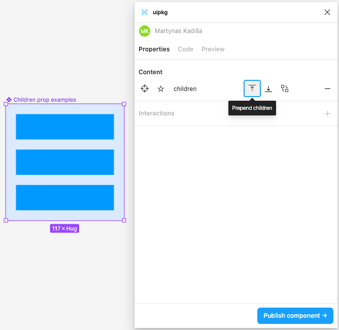
In the preview tab, you can see that the children prop content is placed first.
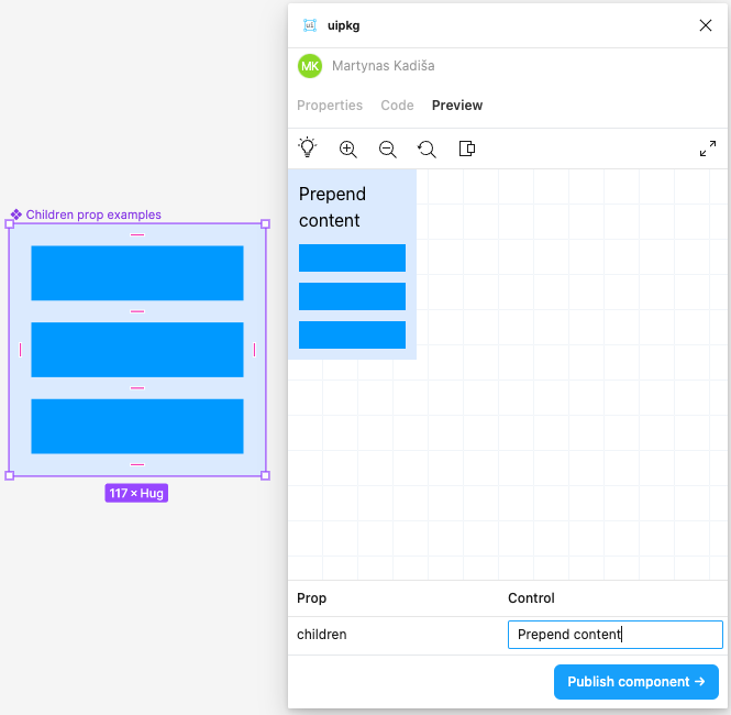
Here's a simplified output of the component above:
const Component = ({ children }) => {
  return (
    <div>
      {children}
      <Frame1 />
      <Frame2 />
      <Frame3 />
    </div>
  );
};
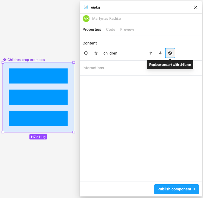
Replace content
Discards previous content and only renders children.
When this behavior is selected, the elements inside this frame will not get transformed by uipkg
This is useful for presentational purposes, where you want to see how content might look like while designing but you want to replace it with your custom components when using it.
In the preview tab, you can see that only the children prop content is rendered.
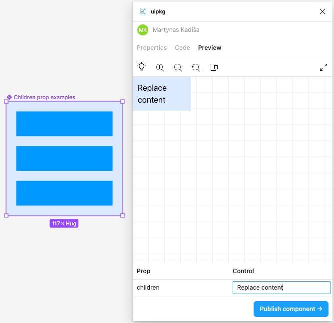
const Component = ({ children }) => {
  return (
    <div>
      {children}
    </div>
  );
};